
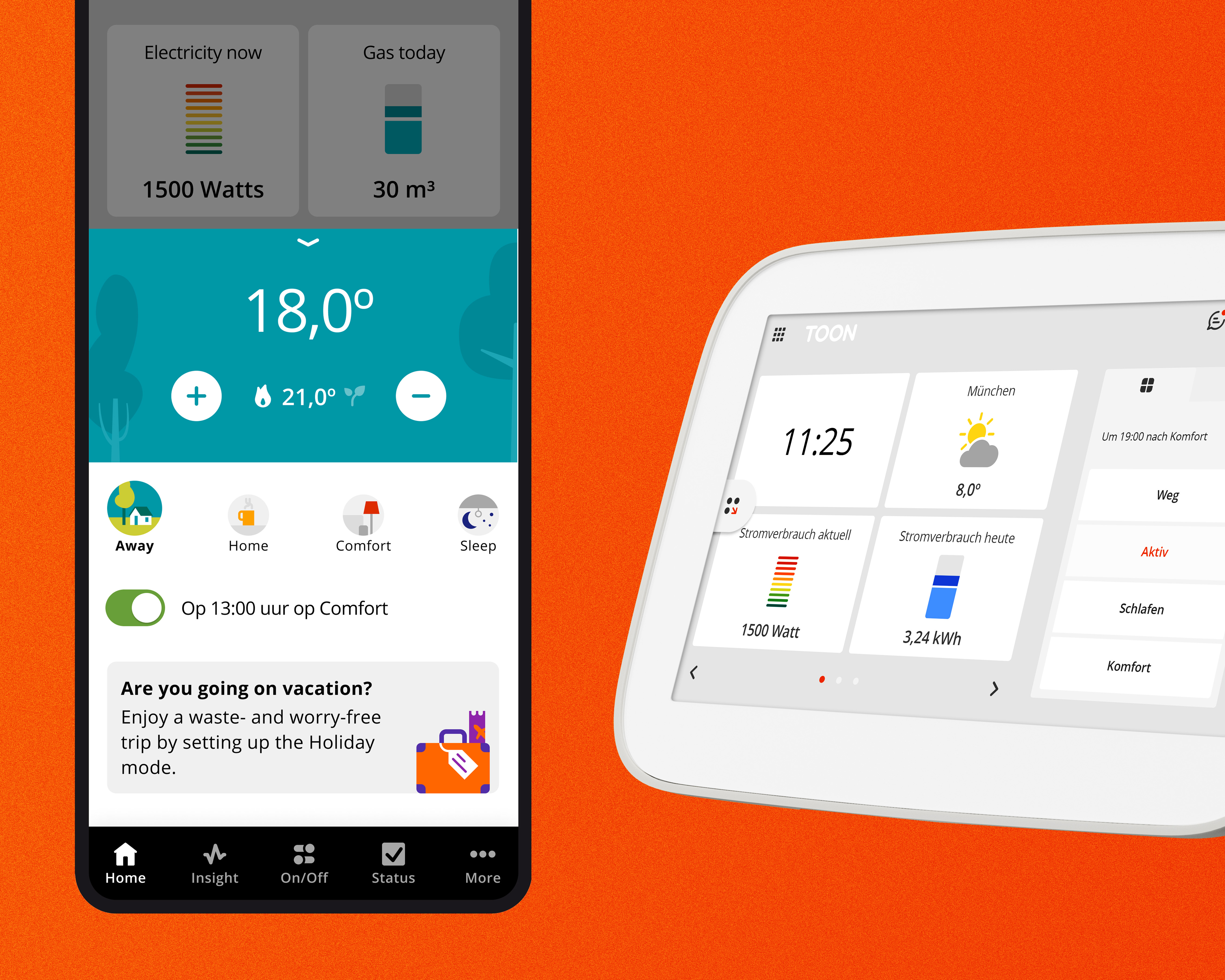
Toon
Toon is a smart thermostat that helps 300.000 users in the Netherlands and Belgium heat their houses and monitor their energy usage and their heating system health. Toon is composed of a device connected to the heating system, electricity/gas meter and the app.
My role
As a visual designer my roler at Quby (the company who builds Toon) was to provide high-fidelity interface design and visual asset ready for implementation , for both app and device. I worked closely with UX designers and helped them translate their ideas into user-centred interfaces. My wofus was on the heating system domain but I was involved in other cross-teams projects. Besides, I lead two fundamentals projects like the re-design of the app navigtion and the design system of app and device. As a project lead, I could go beyond the visual designer role and work also as a PO/UX designer.
Weather service
Context The weather service feature in Toon is one of the most used feature in the device. According to different user researchs, the weather service was percived as chaotic and users felt overwhelmed by irrelevant information.
Solution We decided to reduce the amount of information and re-design the interface, in order to only show what users wanted too see. We also decided to improve engagement by designing illustrations for each weather type.
My contribution I was in the lead to re-design the interface and create the illustration and icons design.


Heating saving overview
Context We wanted to help our users saving on energy consumption. Our goal was to optimize their behaviour to heat their houses without compromising their comfort.
Solution We built a feature that eventually helped users improve their heating behaviour. Together with UX designers, we came up with a solution that was prasing users everytime they were using energy in an optimal way. We achieved this by showing a graph and a flower:the better was their behaviour, the bigger and healthier the flower was.
My contribution I have designed the visual, interactions, icons and illustrations


App navigation
Context Toon users were not able to find all the new features we were buiding for them. A common comment during user interview was: "Oh I did not know ther was this feature!" This was telling us that the navigation was not working as intended.
Solution After several user interviews and card-sorting tests, we decided to distribute all the features in to 5 different tabs on a bottom navigation.
My contribution I was in charge of coordinating a multidisciplinary team to re-design the app navigation. My main task as visual design was to designed the tab component, its interactions, icons, but also the temperature control pannel and the features display pages.


Smart boiler maintenance
Context We wanted to optimize the visits from technicians, so that they would come to the houses only when necesary and not on a regular base. We also wanted to give customers more awareness on the conditions of their boilers.
Solution We displayed more details around their boilers (like parts of the boilers or their activities) and we associated them to a street light system to tell them the gravity of issues on a specific component or feature. If necessary, we would advice them to contact a technician to fix the issue.
My contribution My role was to make the final design of the interfaces and the illustrations necessary for the explanations.


Previous Project
Turing Society

Next Project
Stupor Mundi

